
How To Read Candlestick Chart Patterns In The Stock Market?
Candlestick stock charts are one of the most important techniques used by stock market traders to improve their performance. It allows traders to visually interpret price action in equities and make more informed trade decisions.
One of the most common technical analysis tools used by traders is candlestick analysis, which has been around for decades. Candlestick chart patterns can be combined with other stock market tools and technical analysis, such as momentum indicators, but can stand alone in the charting analysis.
Because they record the entire market information for a day, including price movement, daily stock patterns are the most effective way to view a candlestick chart. Let’s take a closer look at and comprehend the candlestick chart pattern for forex trading.
What are Stock market candlestick chart patterns?
Candlestick chart patterns are a type of technical chart similar to bollinger bands that condenses data from multiple time frames into a single bar and are typically used on a daily basis. It is founded on the idea that because each candle represents a day’s worth of data, news, and market action, candles are more important to long-term traders.
Each candle in a candlestick pattern communicates a separate message by displaying data relating to sellers and buyers. A brilliant candle in the candlestick chart indicates that the sellers won and what happened between the close and open.
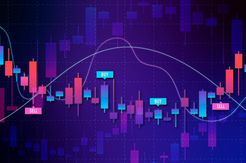
A candlestick chart shows the opening, high, low, and closing prices of a security over a given time period. It has a body and a wick that display price information in a clear and succinct manner.
The candle body displays the price at which a security opened and closed at a given time period, while the candle wick or shadow indicates the high and low security during that time period.
A candlestick chart pattern has two categories:
- Bullish Candlestick – A bullish candlestick has a green body, with the bottom representing the opening price and the top representing the closing price of securities.
- Bearish Candlestick – A bearish candlestick chart features a red body, with the top representing the opening price and the bottom representing the closing price of securities.
Reading a Candlestick Chart Pattern
A candlestick chart indicates timeframes, but a 15-minute candlestick chart is made up of candlesticks that represent 15-minute chunks of data. These chart patterns also has four components that indicate the key prices for a given timeframe. Here are the four components of candlestick chart pattern:
- Open – It symbolizes the first trading price for the candlestick period as well as one end of the candle’s body.
- High – It is the highest trade price for the candlestick period and is symbolized by a vertical line called a wick.
- Low – The low is the candlestick period’s lowest trade price, which is represented by a wick or tail.
- Close – It symbolizes the latest trade price for the candlestick period, which is located at the opposite end of the candlestick’s body.
A candlestick body is made up of open and close trades, with the body being red when the open is higher than the close and green when the open is lower than the close. Furthermore, while the candlestick reading the high and low are represented by vertical lines above and below the body, which are also known as wicks or tails.
Different Types of Candlestick Chart Patterns
Every candlestick chart pattern tells a tale about the slowdown between buyers and sellers, as well as supply and demand. It is crucial to remember, however, that most candlestick patterns require confirmation based on the context of the preceding and following candles. As a result, when recognizing a candle formation, it is vital to examine the surroundings.
For instance, a hammer candle that forms after three bearish candles predicts a near-term capitulation bottom, whereas a hammer candle that forms a flat sideways candle is essentially useless.
To understand and grasp the mechanics of candlestick chart patterns, you must first understand the story that each candle represents. Furthermore, these candlestick patterns keep repeating themselves because the market frequently tries to fool traders when the context is ignored.
Because of the coloring of the bodies, candlestick chart patterns elicit more emotion, and it is required to combine the candles with other indicators to produce the best results. Here’s a look at some of the most prevalent candlestick reversal patterns.
1. Hammer Candlestick
The hammer is one of the reversal candlestick patterns that is used to identify capitulation bottoms followed by a price bounce. It is one of the most widely utilized candlestick chart patterns.
A hammer candlestick chart pattern emerges at the conclusion of a downtrend and has a lower shadow that produces a new low in the downtrend series. It closes back up near or above the open, and its lower shadow or tail must be twice the size of the candle’s body or larger.
Furthermore, an increase in volume helps to consolidate the hammer, and the following candle must shut above the low of the hammer candle above the body.
2. Shooting star candlestick
A shooting star candlestick is the exact inverse of a hammer candlestick and is one of the bearish reversal candlestick patterns that signals a peak or top. The candle should form a star after at least three consecutive green candles, indicating a surge in price and demand.
Furthermore, the upper body or wick of the shooting star candlestick should be double the size of the body, indicating the last of the buyers who have entered the stock, such as profit takers, followed by the short-sellers, who push the price down to close the candle near or below the open.
3. Doji Candlestick
The Doji Candlestick is one of the reversal candlestick patterns that can be bullish or bearish based on the preceding candles’ context. It has the same open and closing price, long shadows, and resembles a cross with a very small body.
A Doji Candlestick is a reversal candle that depicts the direction of the preceding candles, showing the direction of the reversal. Furthermore, if the preceding candle is bullish prior to the formation of the Doji, the next candle beneath the body low triggers a short-sell signal on the break of the doji candlestick and stops above the doji highs.
4. Bullish Harami Candlestick
The bullish harami candlestick is similar to bearish reversal candlestick patterns in that the vast body of the candle actually precedes the smaller harami candle. On the other side, the preceding red candle should signify the big body candlestick’s submission, which signifies the lowest point in the sequence.
This sequence shows a capitulation sell-off preceding the harami candle, which trades well within the previous candle’s range. The harami candlestick is a subtle indicator that often keeps sellers calm until the trend gradually reverses.
5. Bearish Harami Candlestick
The bearish harami is the inverse of the bullish harami, in which the preceding candle should totally eclipse the harami candle’s range. When uptrends are at their height, these eclipses take place before the small harami candlestick forms and after the preceding green candlestick has reached a new high with a large body.
When the bearish harami candlestick closes, the next candle closes lower, causing longs to get concerned, and when the low of the preceding candle breaks, it causes a panic sell-off as longs flee for the exits to limit further losses.
Takeaway
A single candlestick signal or a multi-candle pattern may be included in the candlestick signals. They are, nevertheless, great forward-looking indicators that require confirmation by consecutive candles before defining and trading on a certain pattern. Furthermore, using this candlestick chart pattern guidance, you may understand how market psychology works and make better trades in the market.
FAQs
1. Can Candlestick Patterns Predict Market Turning Points?
Yes. Some candlestick patterns are used specifically to predict trend reversals. However, this does not imply that they can always ensure success.
2. What Is the Difference Between a Candlestick Chart and a Bar Chart?
Yes. The candlestick chart is not the same as the bar chart, although they do share certain similarities in that they both display the same amount of price data. Most traders, however, believe that candlestick charts are easier to interpret.
3. Is it possible to benefit from candlestick patterns?
Candlesticks are useful in trading since they show four price points (open, close, high, and low) over the selected time period.